- Y axis not starting from 0
When the Y axis does not start from 0, it can have a huge impact on the graphs. A 1% increase could be made to look like a 300% increase if the Y axis does not start at 0.
Here is an example:  Even though Firefox is only 9% slower, it looks like over 50%, because the Y axis does not start at 0.
- Skewed axes
Sometimes, the X or the Y axis labels could be skewed. Make sure the you know whether the Y axis scale is linear or logarithmic or randomly skewed to exaggerate the data. If the X axis does not scale continuously, it could be a sign of cherry picking data.
Here, there are cherry picked dates. The scale does not go linearly.
- Going against conventions
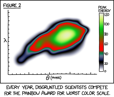
Sometimes, graphs with colour trick you by showing the darker colours as the low numbers and the light colour as high number. This is misleading as it is expected that darker colours correlate with higher numbers. Make sure you read the key.
Here is an example: https://xkcd.com/2537/
No comments:
Post a Comment